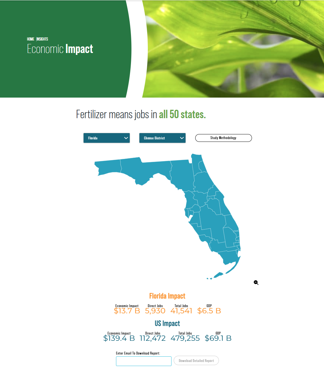
Economic Impact Study
How do you make national economic data meaningful at a local level? That was the challenge behind TFI’s Economic Impact Study. Working closely with Veronica Nigh, TFI’s Chief Economist, and the team at ComplEat Analytics, I led design direction for the project and created the visual design for the downloadable state-level PDFs that sit within the study’s interactive map. The goal was to translate complex economic analysis into clear, accessible visuals that policymakers, industry stakeholders, and the public could quickly understand.
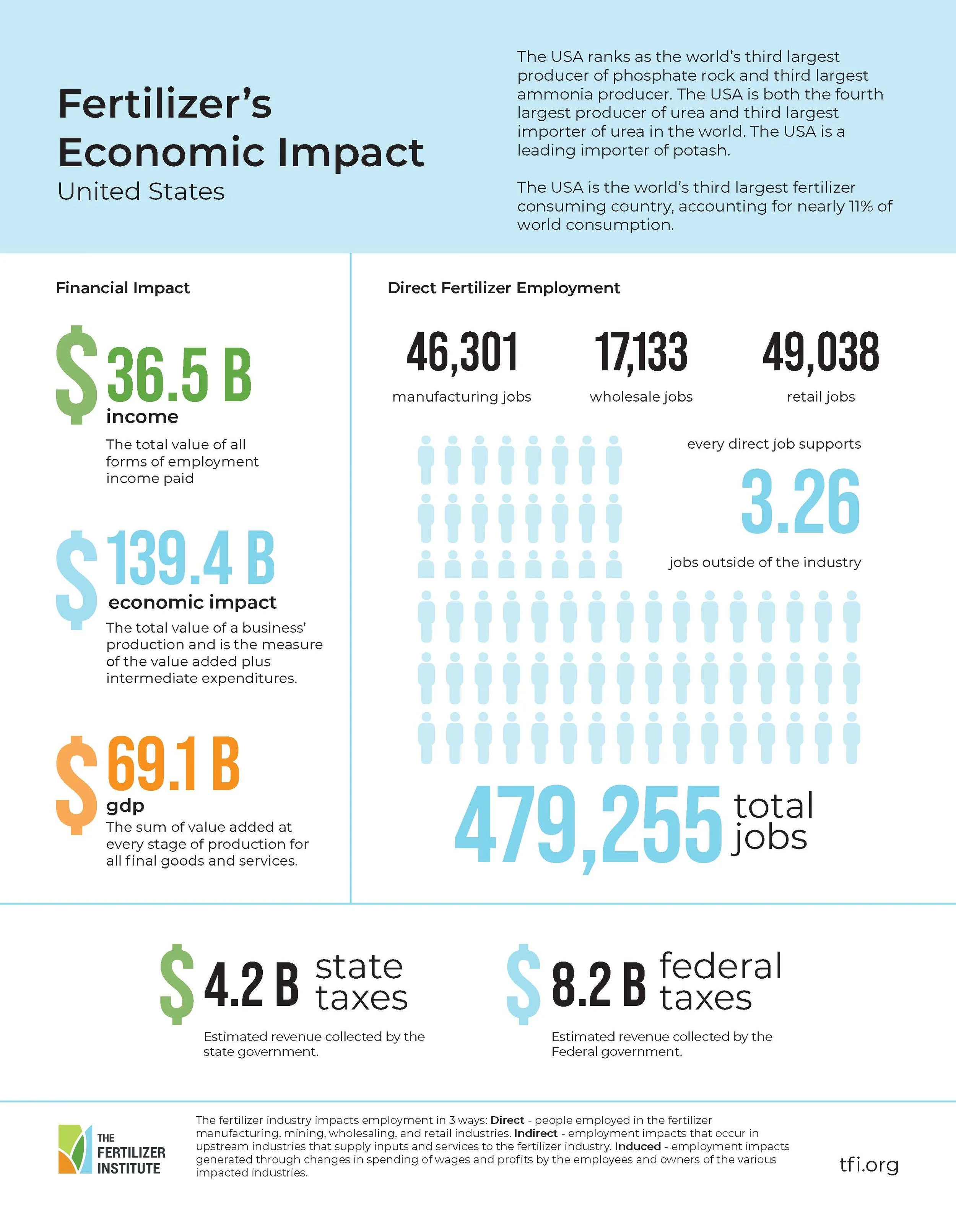
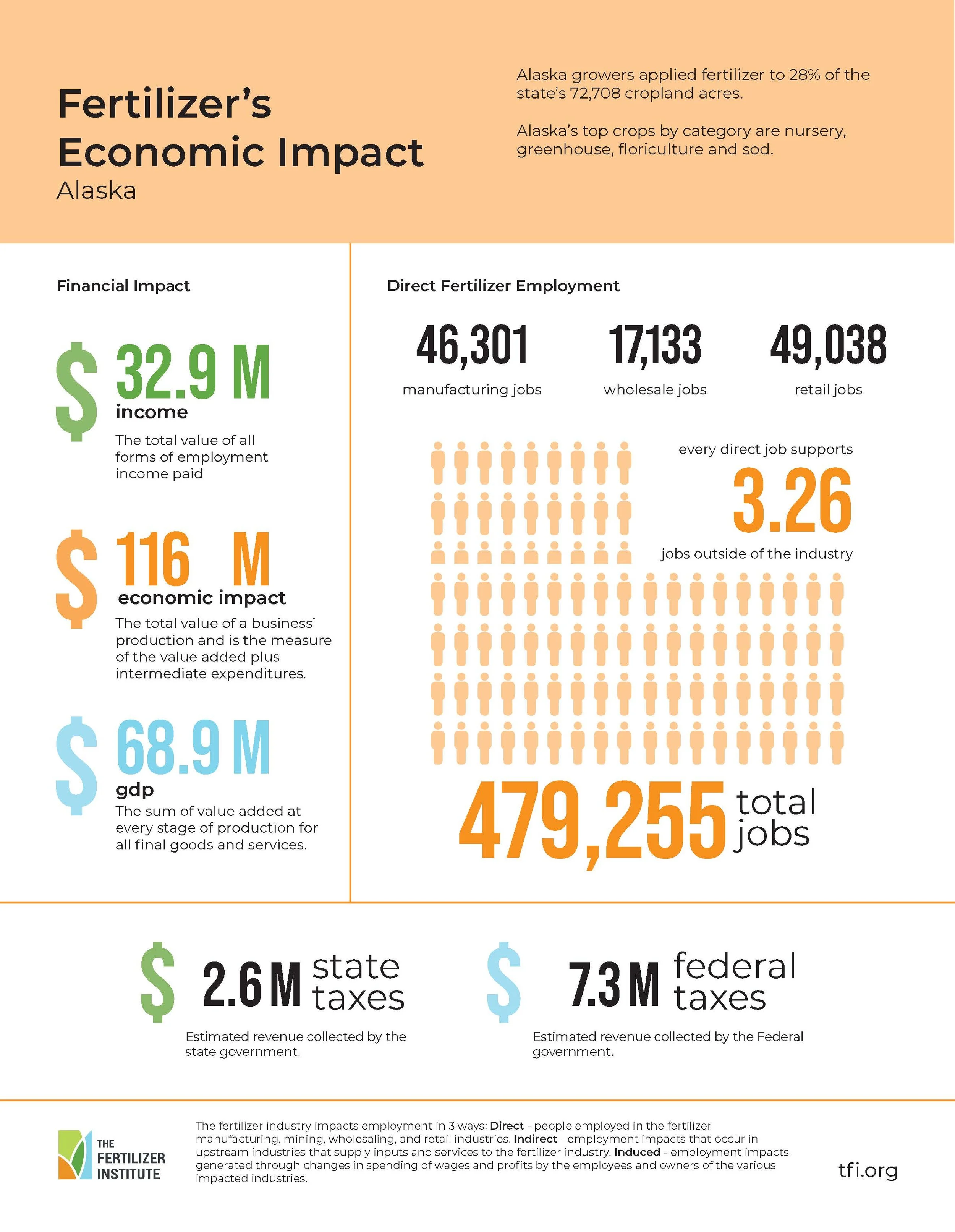
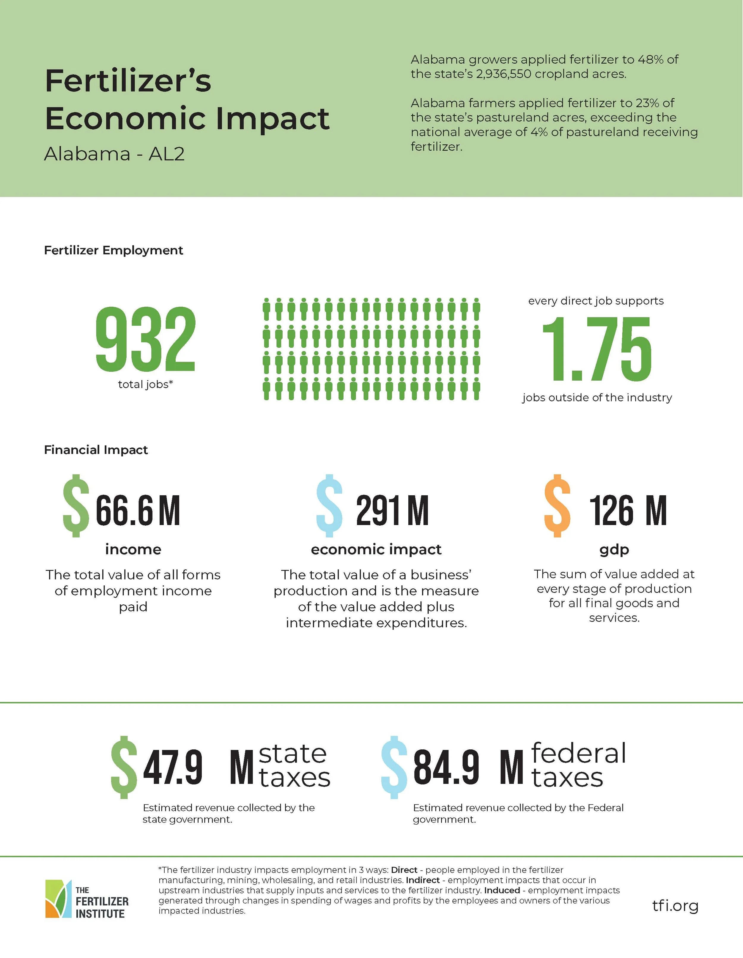
SuccessesTranslated dense economic modeling and state-level data into clean, readable one-page summaries that made the findings easier to grasp at a glance.
Designed a consistent visual system for the PDFs that worked seamlessly within the larger interactive map experience.
Collaborated closely with the economist and analytics team to ensure the design accurately reflected the methodology and findings.
LessonsData-heavy projects benefit from establishing visualization standards early (chart types, hierarchy, labeling) to streamline later production.
Tight coordination between analysts and designers early in the process helps prevent rework when translating technical findings into visuals.
Even highly analytical audiences appreciate strong visual storytelling. It improves clarity without sacrificing rigor.